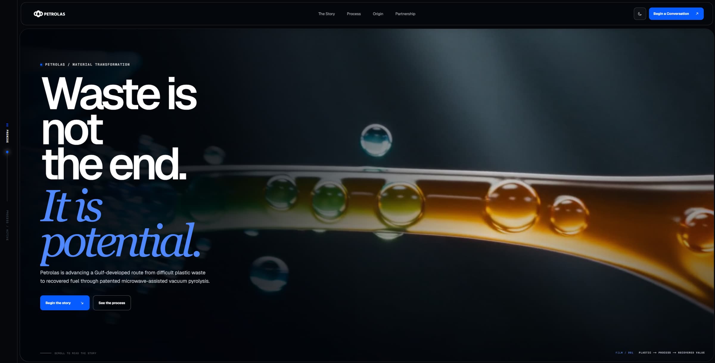
01 — Brand identity
IDENTITY
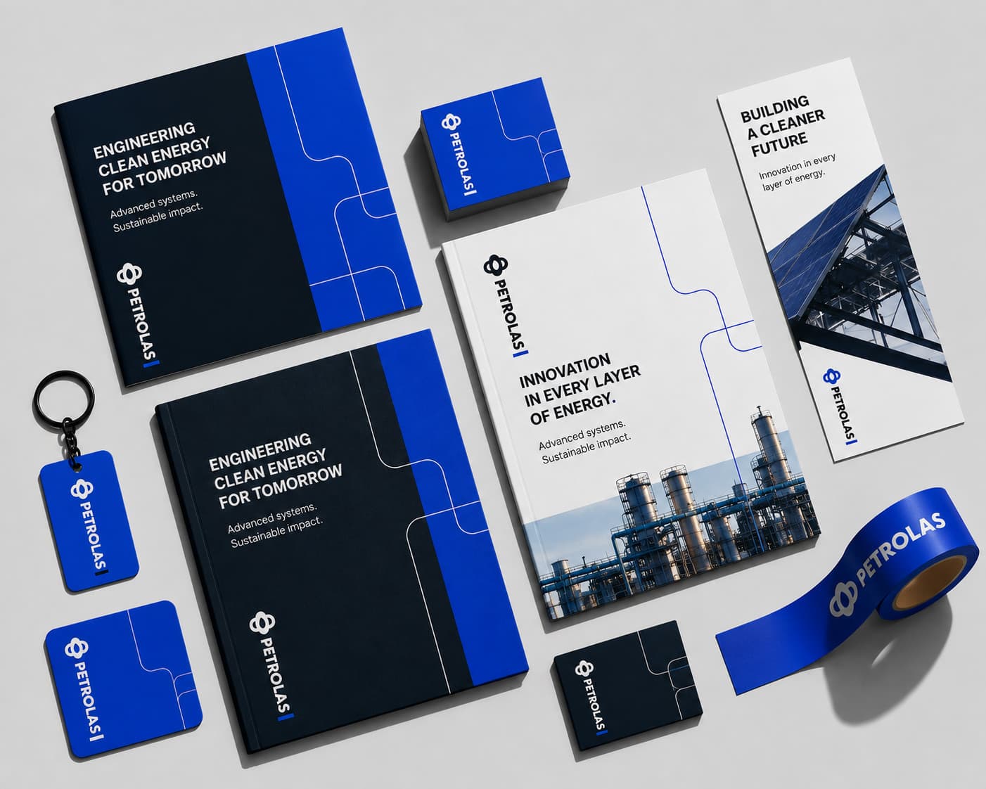
Mark, colour, type, and voice — built to hold from a business card to a trade-show hall without losing itself.
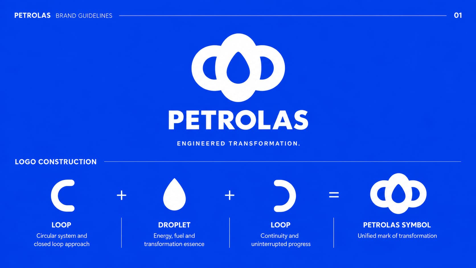


A conventional energy business repositioning toward clean energy — given an identity, campaigns, and a digital presence that match where it is actually headed.
01 — Brand identity
Mark, colour, type, and voice — built to hold from a business card to a trade-show hall without losing itself.
02 — Brand system
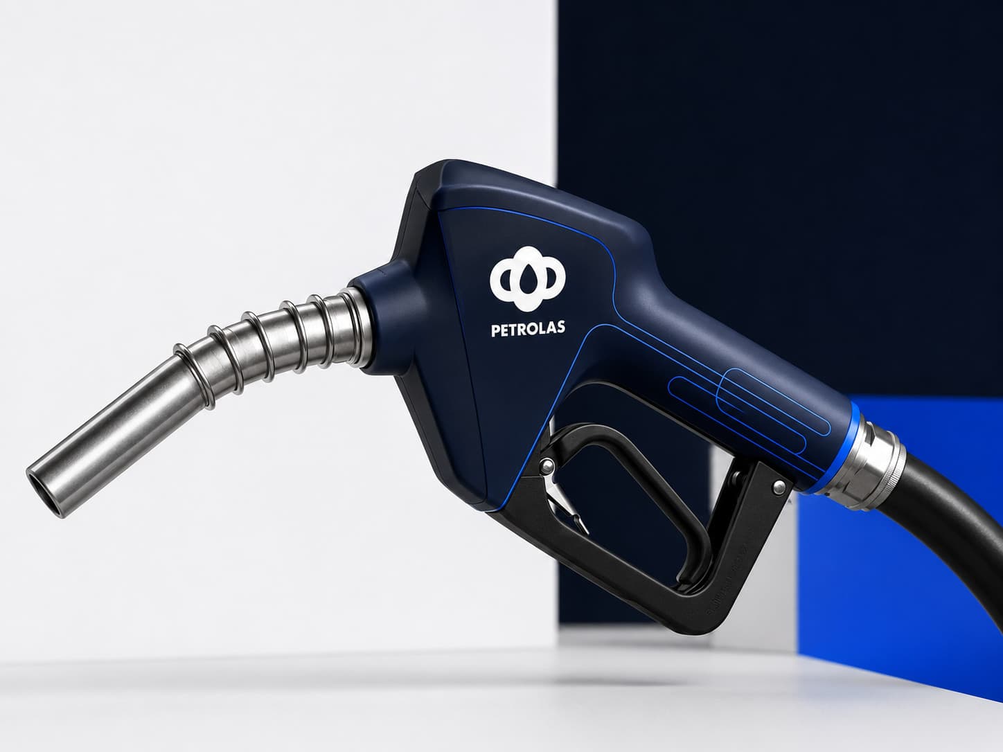
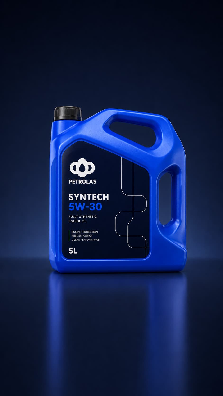
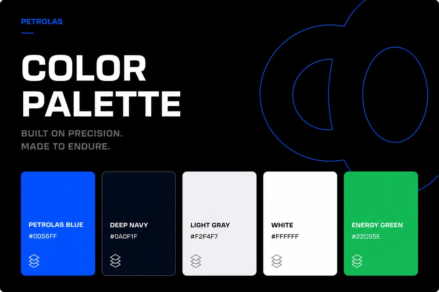
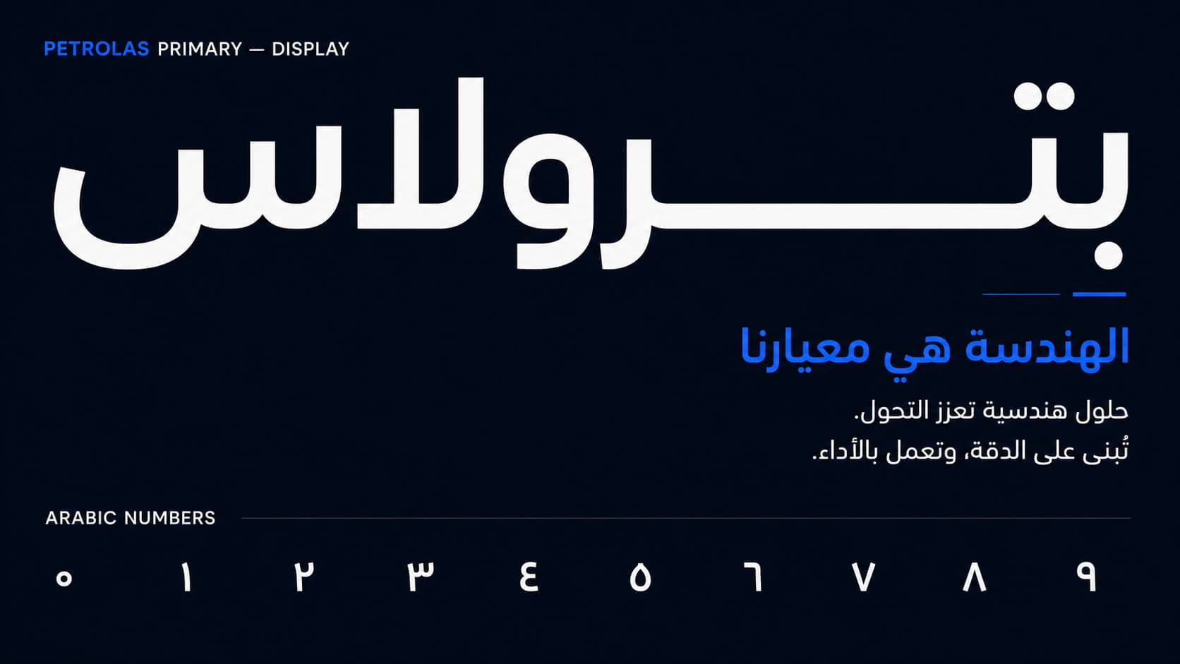
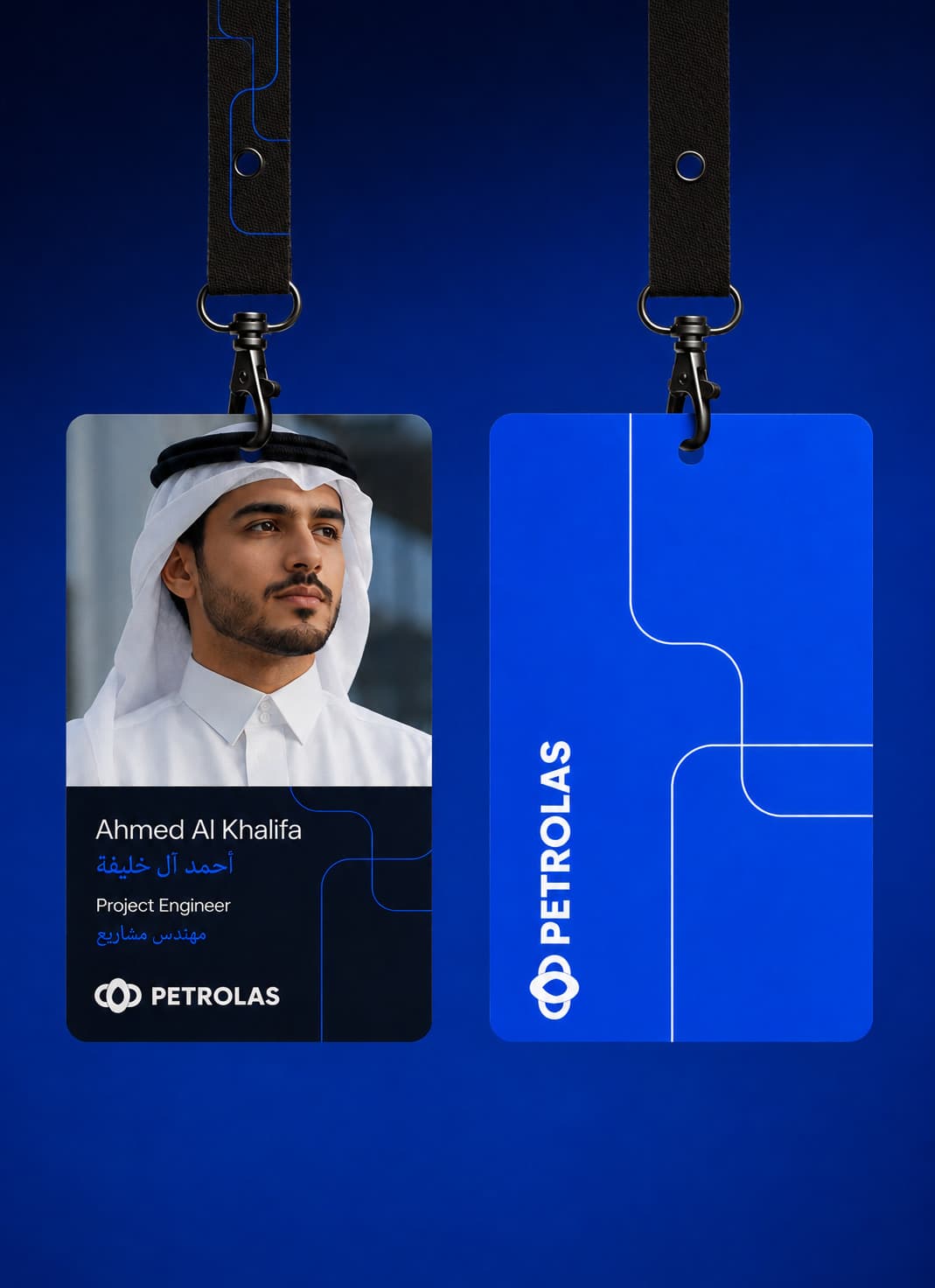
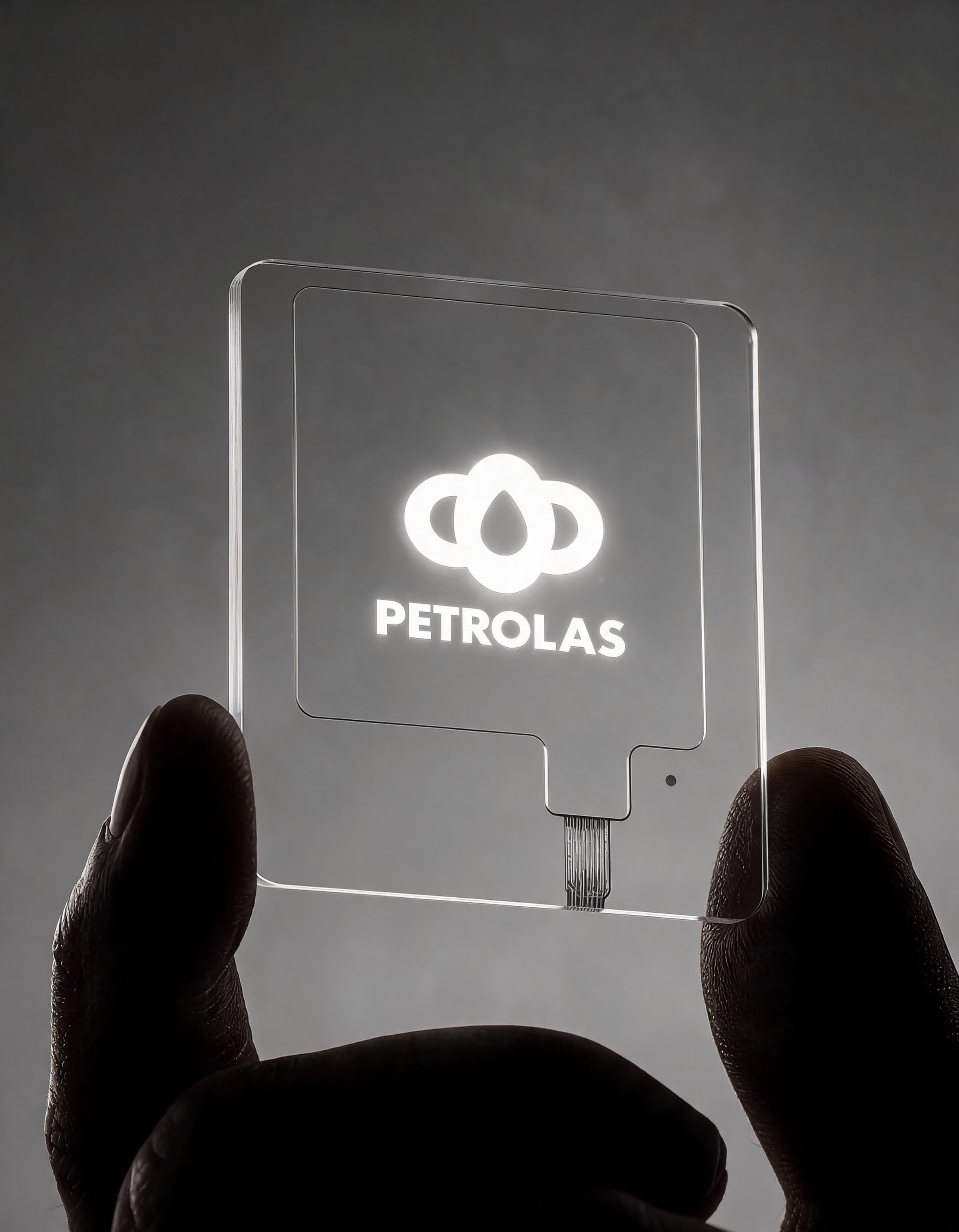
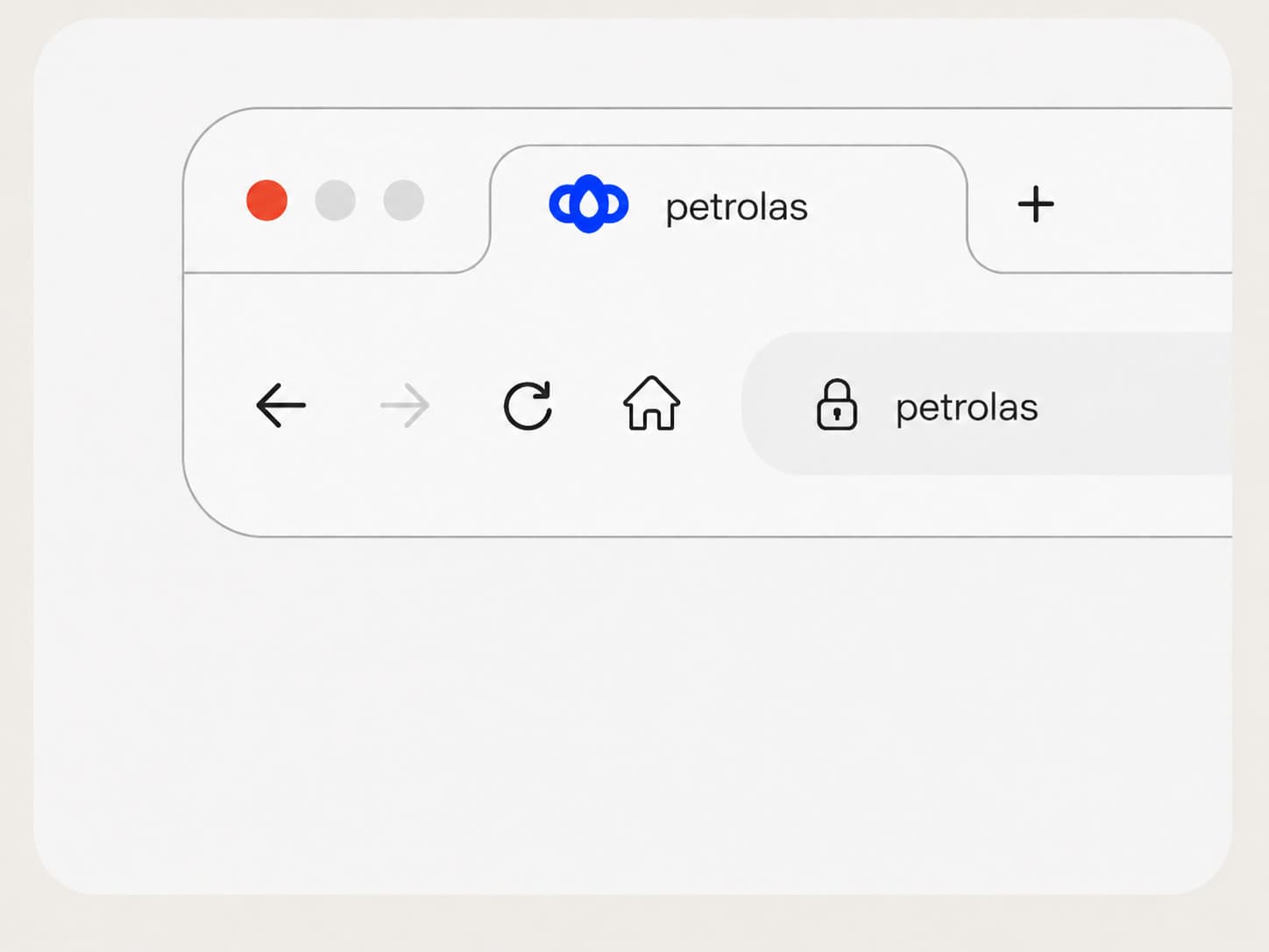
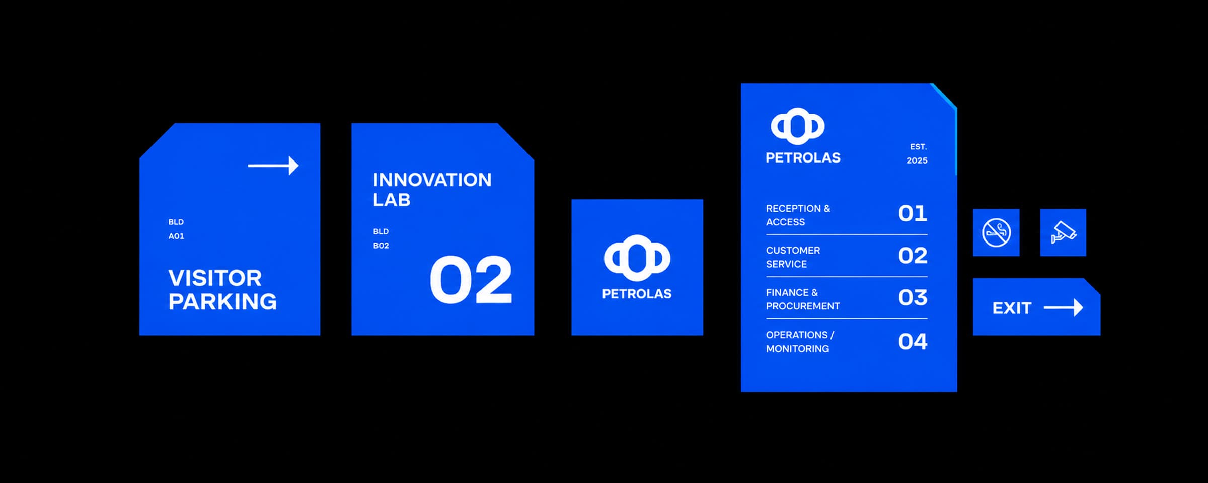
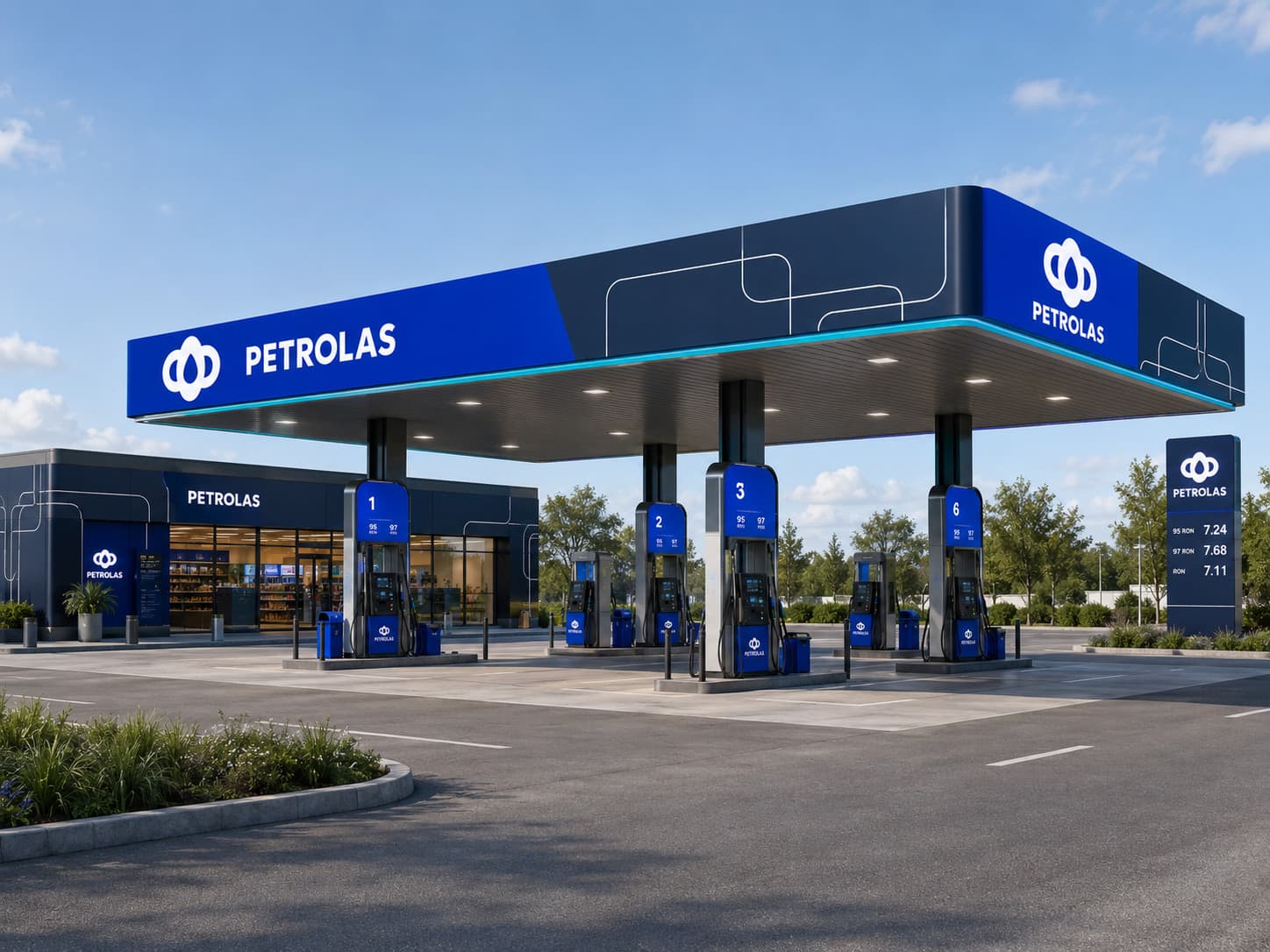
A mark is one shape. A system is what makes it usable everywhere — the palette, the type, and the rules that hold them together across every surface the business puts its name on.
03 — Campaign
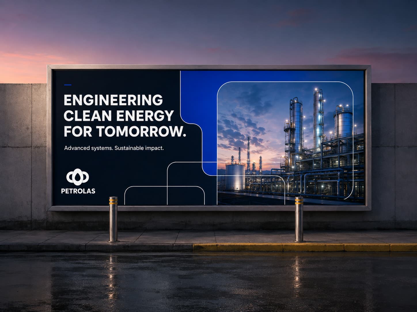
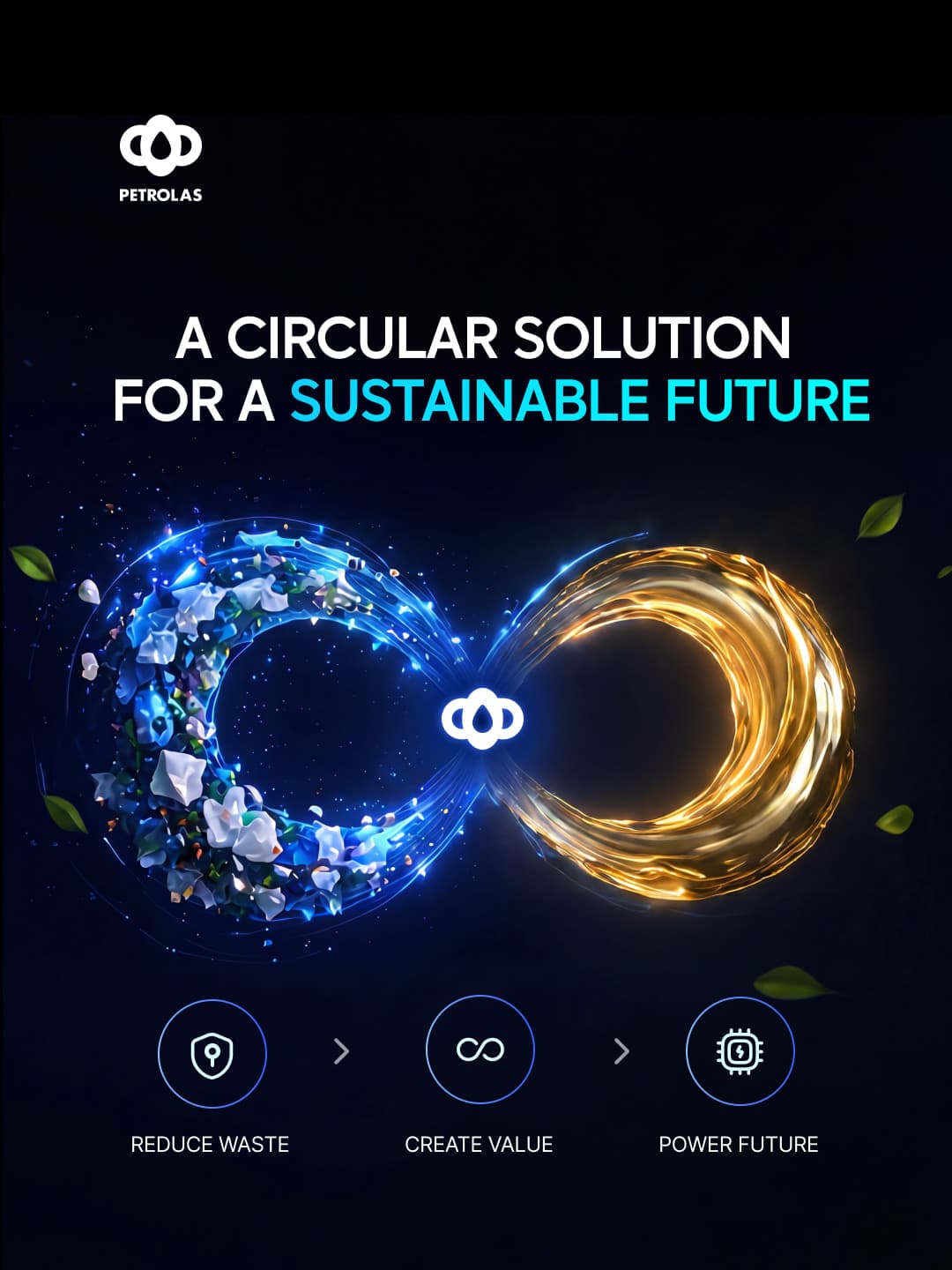
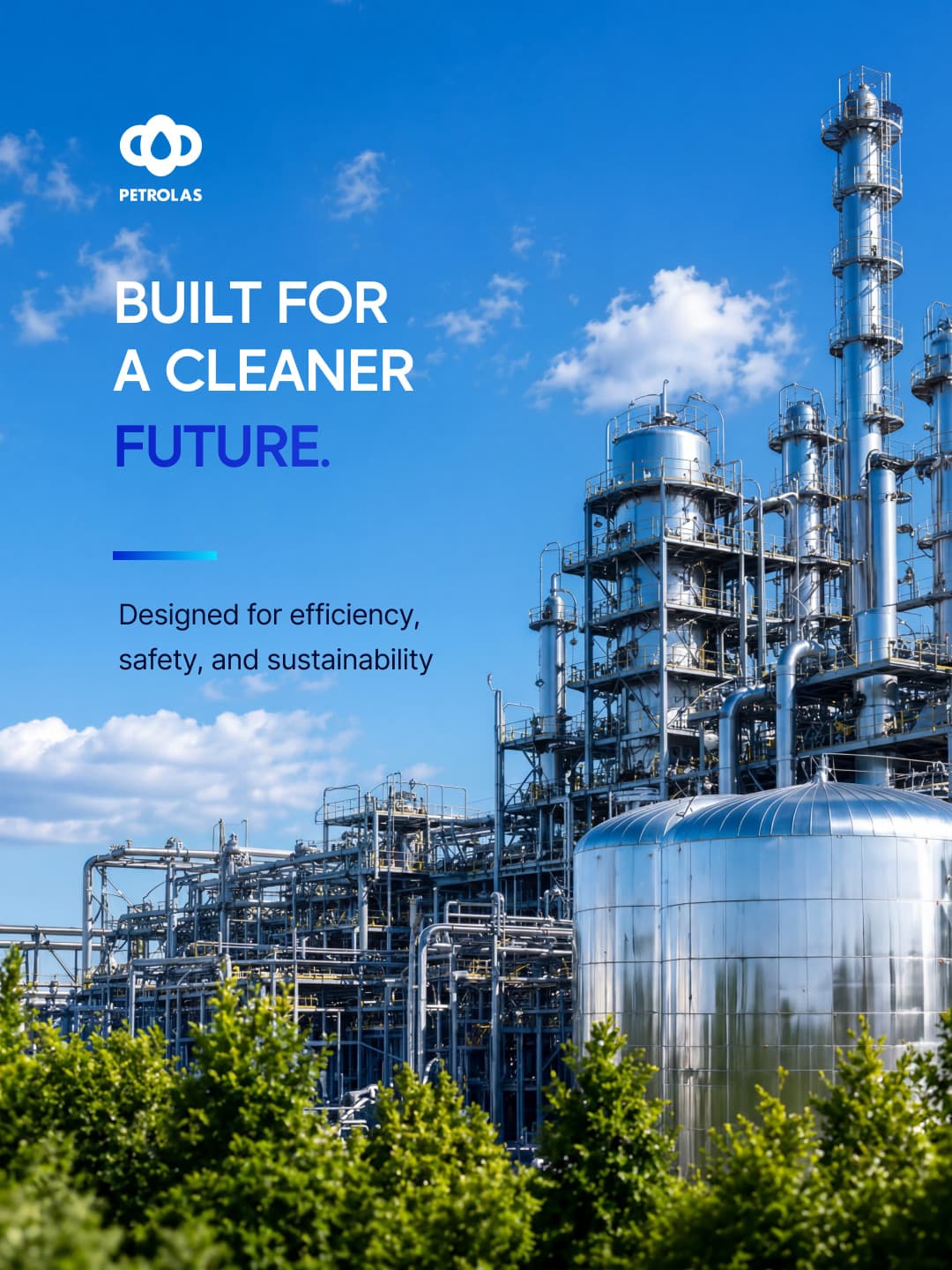
One argument, carried across every format the business actually buys — not three unrelated adverts.
04 — Digital
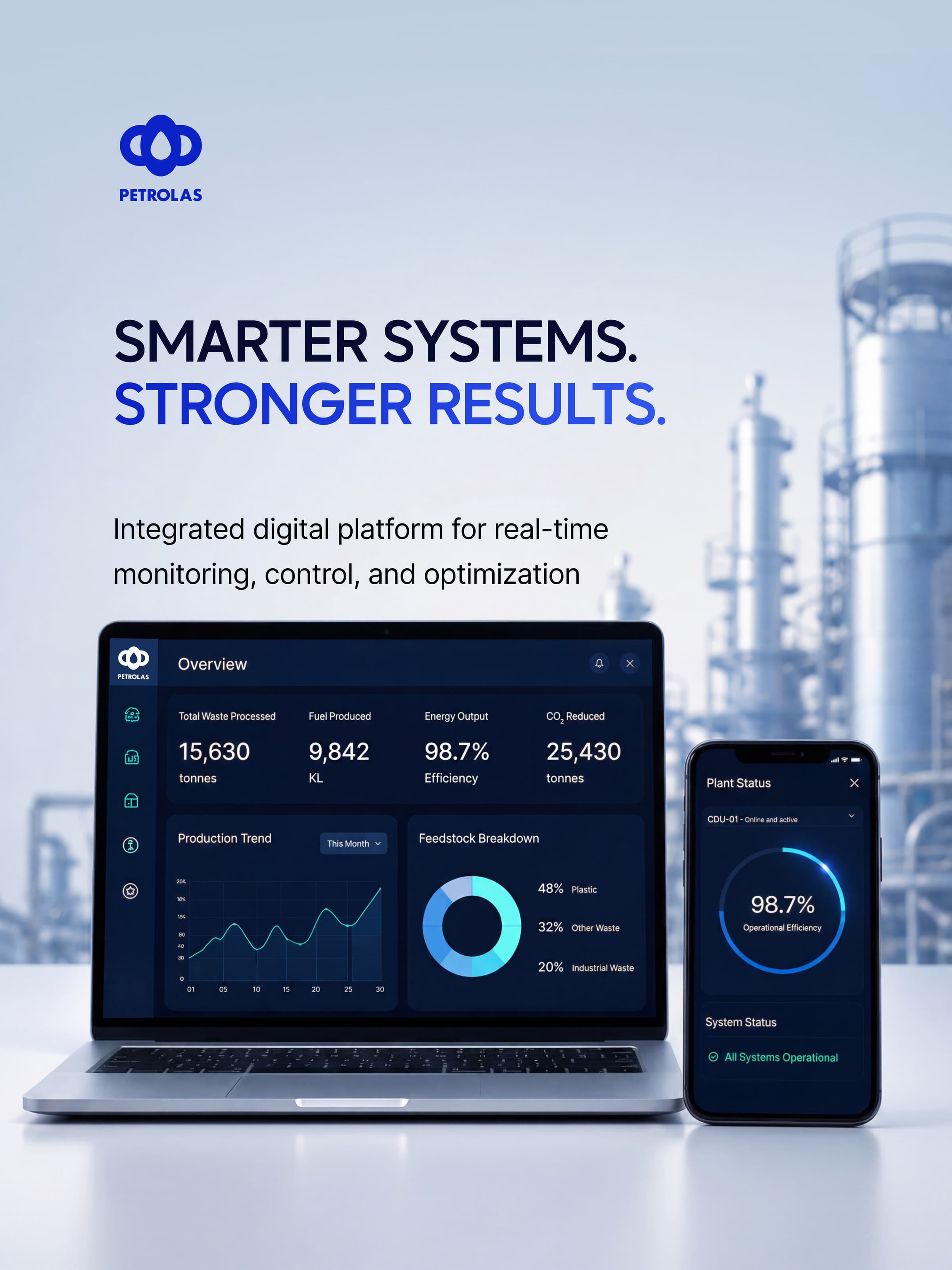
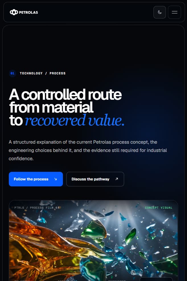
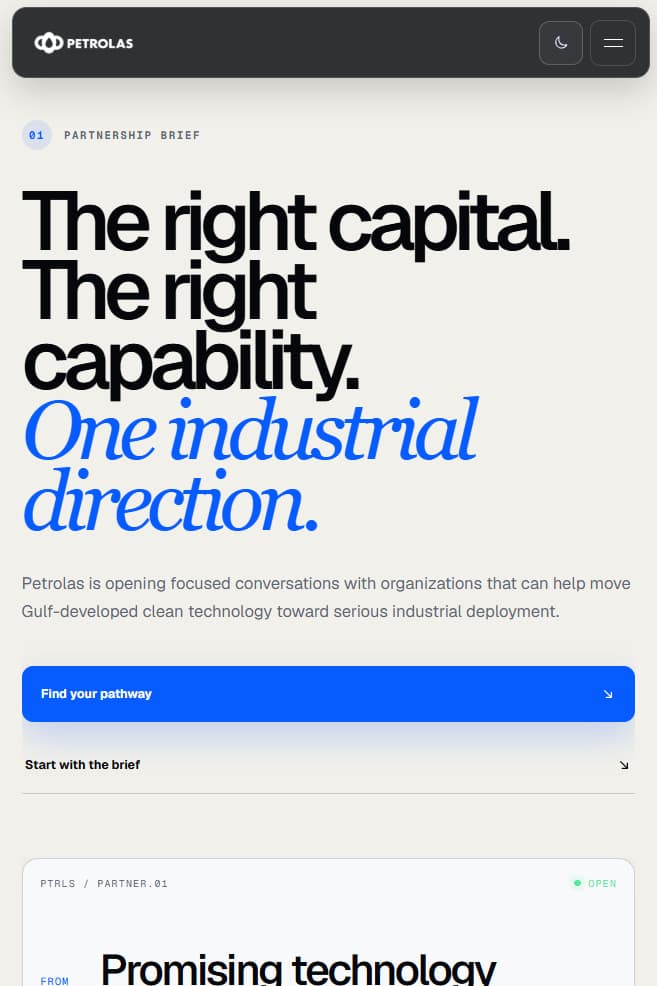
The same language carried into screens — social, site, and a live operations view built in the identity, not beside it. The partnership page is the argument at its sharpest: a serif italic against the grotesque, and a brief set as a document rather than a pitch.
05 — Environmental
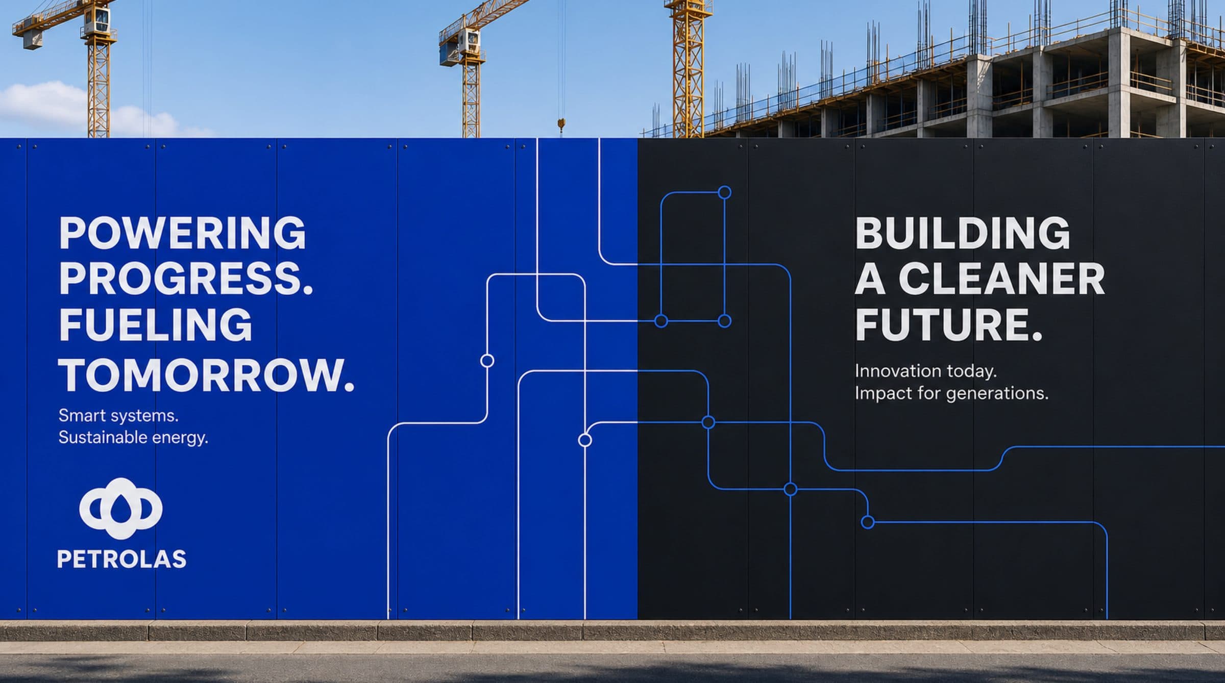
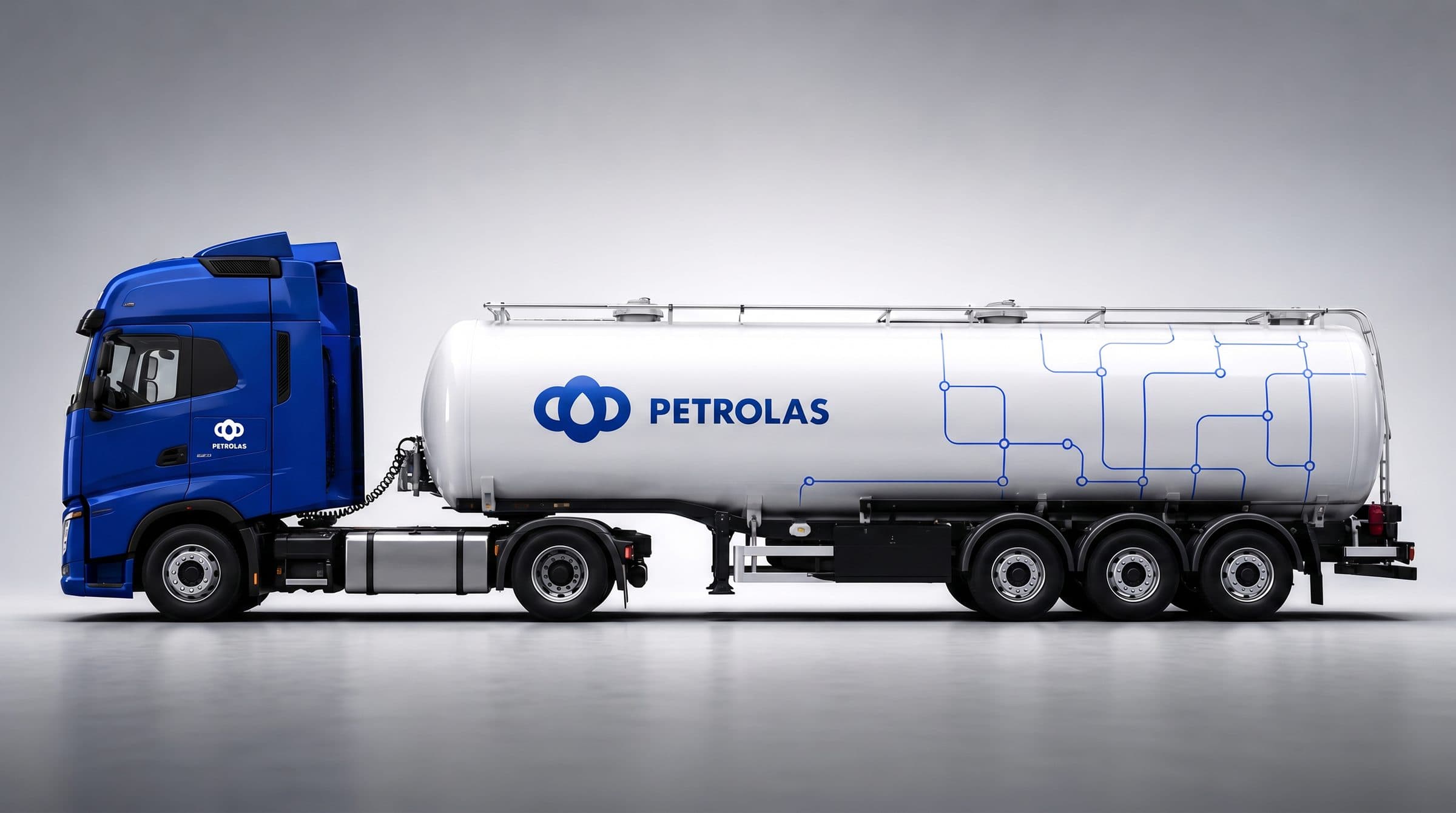
The identity had to survive outside a browser — on a hoarding, on a fleet, wherever the business physically shows up.
“Ali built Petrolas into a clear, recognizable brand across every physical and digital touchpoint. His research-led, precise execution helped us launch with confidence, strengthen awareness, and attract valuable supporters and investors.”
A first conversation is a conversation — what the business is, where it’s going, and whether the way it looks is keeping up.